Monochrome Magic: Decorating with a Single Color Palette
Monochrome interiors may sound restrictive, but in truth, they offer some of the most striking and sophisticated design possibilities.
Introduction
Monochrome interiors may sound restrictive, but in truth, they offer some of the most striking and sophisticated design possibilities. Decorating with a single color palette doesn’t mean every wall and object has to match exactly—instead, it’s about exploring a spectrum of shades, tones, and textures within one core color to build depth, mood, and personality.
In this blog, we’ll break down the art of monochrome decorating, showing how to use one color family to create a space that’s cohesive, creative, and anything but boring.
1. What Is Monochrome Design?
At its core, monochrome design refers to the use of a single base color throughout a space. This includes the full range of tints, tones, and shades derived from that color.
For example:
- A monochrome blue room could feature pale sky blue, deep navy, dusty slate, and bold cobalt
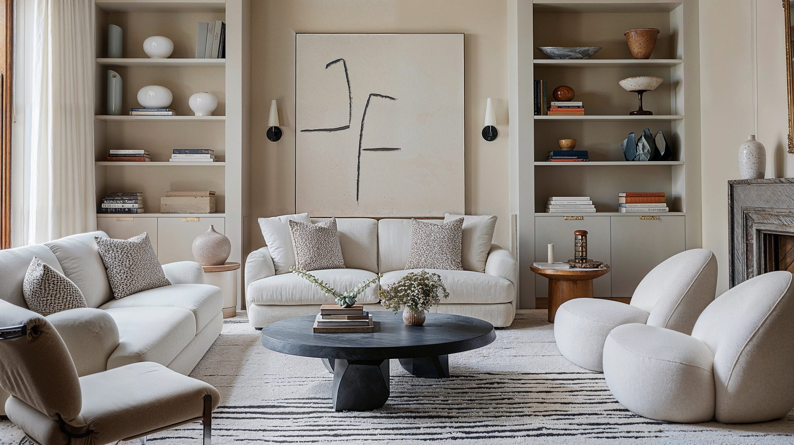
- A beige-based space might include ivory, taupe, camel, and sand
This approach simplifies your palette while offering endless variation in mood and expression.
2. Why Choose a Monochrome Palette?
Monochrome design has several aesthetic and practical benefits:
- Cohesion: Everything flows naturally, reducing visual clutter
- Elegance: Monotone spaces often feel elevated and intentional
- Flexibility: You can go bold (black, red) or calm (neutrals, pastels)
- Creativity: Limiting your palette pushes you to experiment with form, finish, and texture
It’s especially effective in small spaces, open-concept homes, or areas where you want calm and clarity.
3. Start with the Right Base Color
Choosing your base color is the most important step. Consider the mood and purpose of the room:
- Warm neutrals (beige, taupe, cream) for softness and serenity
- Cool tones (blue, grey, green) for calm and freshness
- Bold hues (navy, charcoal, emerald) for drama and depth
- Soft pastels (blush, lavender, pale mint) for whimsy and brightness
Stick with a color you genuinely love—it will be the dominant voice in your space.
4. Mix Tones and Shades to Create Depth
To avoid a flat look, layer different variations of your chosen color:
- Tints: Add white for lighter versions
- Tones: Add grey for more muted shades
- Shades: Add black for richness and drama
Example: In a green room, try sage on the walls, olive upholstery, mossy accents, and deep forest accessories.
This range brings richness to the design while staying within your monochrome boundary.
5. Lean Into Texture and Material Variety
Since your palette is limited, texture becomes the hero. It adds interest, movement, and a tactile quality to your interiors.
Try layering:
- Matte and glossy finishes
- Smooth stone with woven fabrics
- Natural wood with soft velvet
- Glass, metal, and fabric in a tonal trio
In a white monochrome room, for instance, a chunky knit throw, marble table, and sheer curtains work together to create depth and softness.
6. Use Pattern—Subtly
Monochrome design doesn’t mean you have to skip the pattern. In fact, patterns can add dimension while still honoring your palette.
Examples include:
- Tone-on-tone stripes or chevron
- Geometric shapes in similar shades
- Subtle floral or abstract motifs in layered tints
Stick to patterns that are either low-contrast or match the tonal range to maintain unity.
7. Play with Light and Shadow
Lighting has a huge impact in monochrome rooms—it highlights texture and variation, and changes the way shades interact.
Tips:
- Use warm lighting to soften dark hues
- Add dimmers for adjustable ambience
- Highlight textured walls or fabrics with directional lighting
- Use reflective surfaces like mirrors and metallics to bounce light around
In a dark monochrome space, strategic lighting keeps the room from feeling heavy.
8. Let Shape and Silhouette Stand Out
In the absence of color contrast, form becomes more noticeable. Choose furniture and decor with distinctive shapes or artistic curves.
Think:
- A sculptural chair in the same hue as the walls
- An arched mirror against a tone-matching background
- A bold pendant light suspended in a monochrome corner
This interplay of form adds sophistication and ensures the space doesn’t feel monotonous.
9. Add Focal Points and Contrast Within the Theme
While the whole room follows one palette, it helps to introduce contrast through:
- A dramatically darker or lighter version of your core color
- A focal wall in the deepest tone
- Artwork or decor that brings in structure while staying tonal
In a grey monochrome space, a near-black charcoal sofa or a pale grey accent wall can serve as grounding points without straying from the theme.
10. Keep It Intentional and Curated
Monochrome design thrives on restraint and careful editing. Avoid overcrowding, and give each element space to shine.
Ask yourself:
- Does this piece contribute to the overall color story?
- Is there enough texture or contrast to create interest?
- Are shapes and lines working together harmoniously?
Keep your selections tight, and don’t be afraid to leave negative space—it’s part of the magic.
Conclusion
Monochrome decorating is a powerful way to create serene, stylish, and impactful interiors. By exploring the full range of a single color and thoughtfully layering tone, texture, light, and shape, you can build a space that’s as visually rich as it is calming.
Whether you’re drawn to soft neutrals or bold statement hues, monochrome design invites you to dive deep into the nuance of simplicity—proving that one color, done right, can speak volumes.
Recent Blogs
-

How to Choose the Best Luxury Watches 2026 Without Overpaying
-

Tesla Cybertruck vs Traditional Trucks: What Actually Matters Before You Buy
-

How to Choose a Fat Loss Program That Actually Works (Without Burning Out)
-

Upgrade Your Watch Style With Premium Strap Choices
-

How Reducing Stress Naturally Improves Your Daily Health Habits